01
Content hierarchy
Important information needed to remain visible and understandable without competing with every other element on the screen.
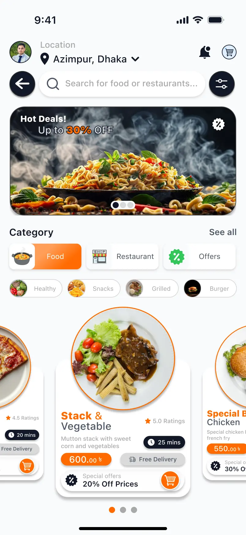
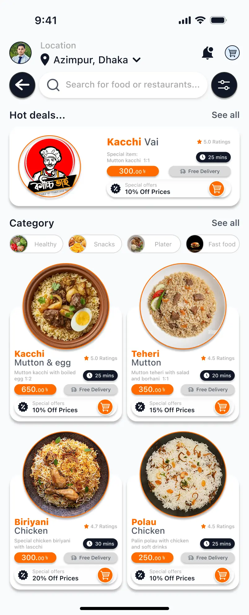
A modern mobile food delivery experience designed to make food discovery, restaurant browsing, meal selection, and ordering simple, clear, and visually engaging.
UI/UX Designer
Mobile Application
Product Design
2026
The project focused on creating a mobile food delivery experience where users can quickly discover food, browse available options, and move toward ordering without unnecessary complexity.
The interface uses clear hierarchy, strong food imagery, accessible navigation, and consistent interaction patterns so users can understand what matters and what to do next.
Food delivery applications need to present restaurants, categories, promotional content, ratings, prices, food details, and primary actions without making the interface difficult to scan.
Important information needed to remain visible and understandable without competing with every other element on the screen.
Users needed a clear way to identify relevant restaurants and meals without unnecessary navigation.
Navigation, product information, and important actions needed to remain accessible within limited screen space.
The design process focused on understanding the main ordering journey first, then organizing information and refining the visual system around that journey.
Defined the primary user journey and identified the information and actions users would need during food discovery and ordering.
Organized categories, food content, product information, navigation, and primary actions into a clear mobile-first hierarchy.
Developed a consistent interface using strong food imagery, clear typography, spacing, cards, visual grouping, and focused call-to-action elements.
Refined screen composition, spacing, hierarchy, and interaction emphasis to make the experience easier to understand and visually balanced.
Food imagery receives strong visual priority so users can identify relevant options quickly, while ratings, pricing, and supporting information remain compact and easy to scan.
Repeated card patterns, consistent spacing, clear typography, and predictable actions help different parts of the application feel like one connected experience.
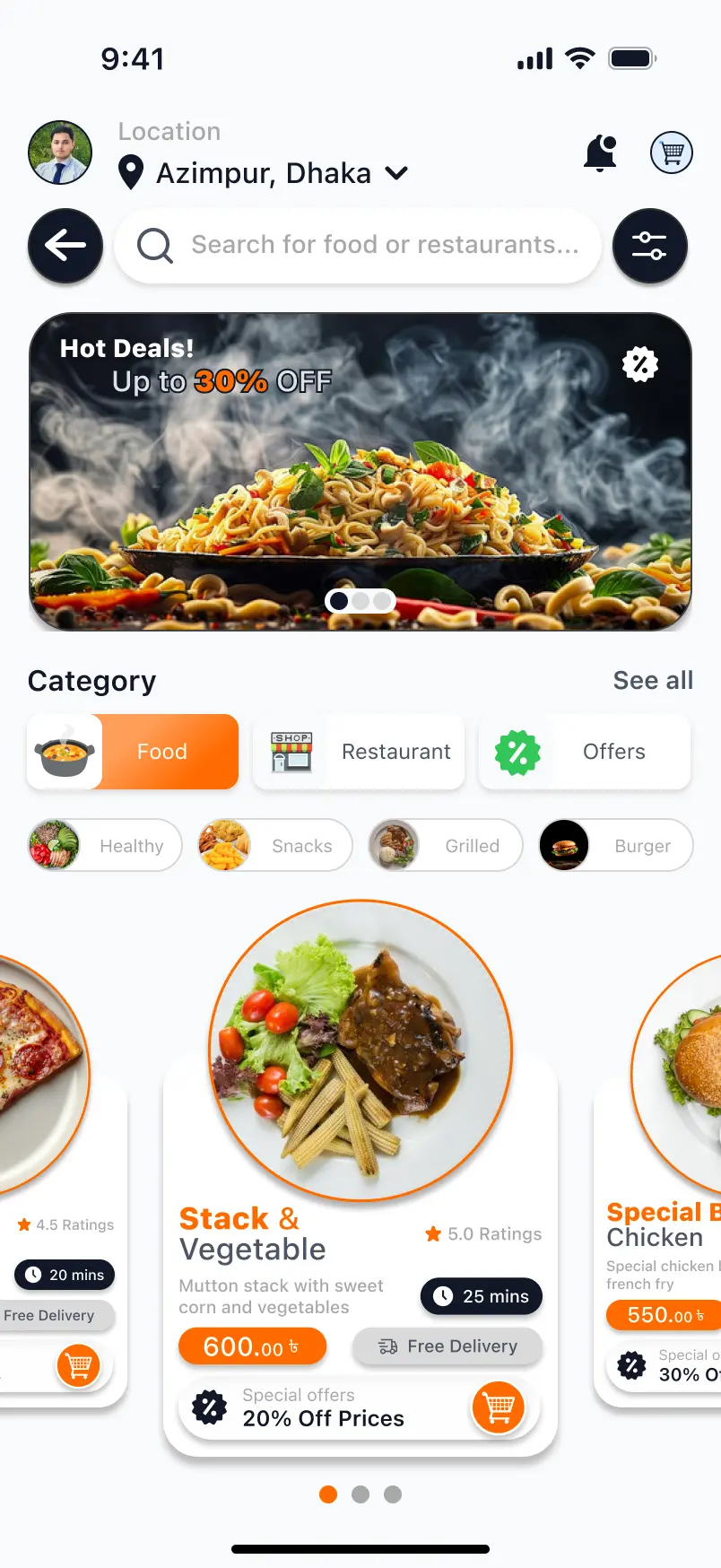
Food imagery receives strong visual priority so users can identify relevant options quickly while supporting information remains easy to scan.
Important actions are visually separated from secondary information to reduce hesitation and make the ordering journey easier to follow.
The interface uses controlled spacing and grouped information to present useful content without making the mobile screen feel crowded.
Repeated card styles, typography, spacing, and interaction patterns create familiarity as users move through different parts of the application.
The final screens bring food discovery, navigation, visual hierarchy, product information, and important ordering actions together into one consistent experience.
The final design brings food discovery, visual hierarchy, navigation, product information, and primary ordering actions into one focused mobile experience. The interface prioritizes clarity and usability while maintaining a modern visual identity.