01
Information hierarchy
Projects, experience, skills, achievements, services, and contact information needed to coexist without making the page feel crowded.
A responsive personal portfolio designed to present UI/UX work, frontend development skills, experience, achievements, and selected projects through one consistent interactive interface.
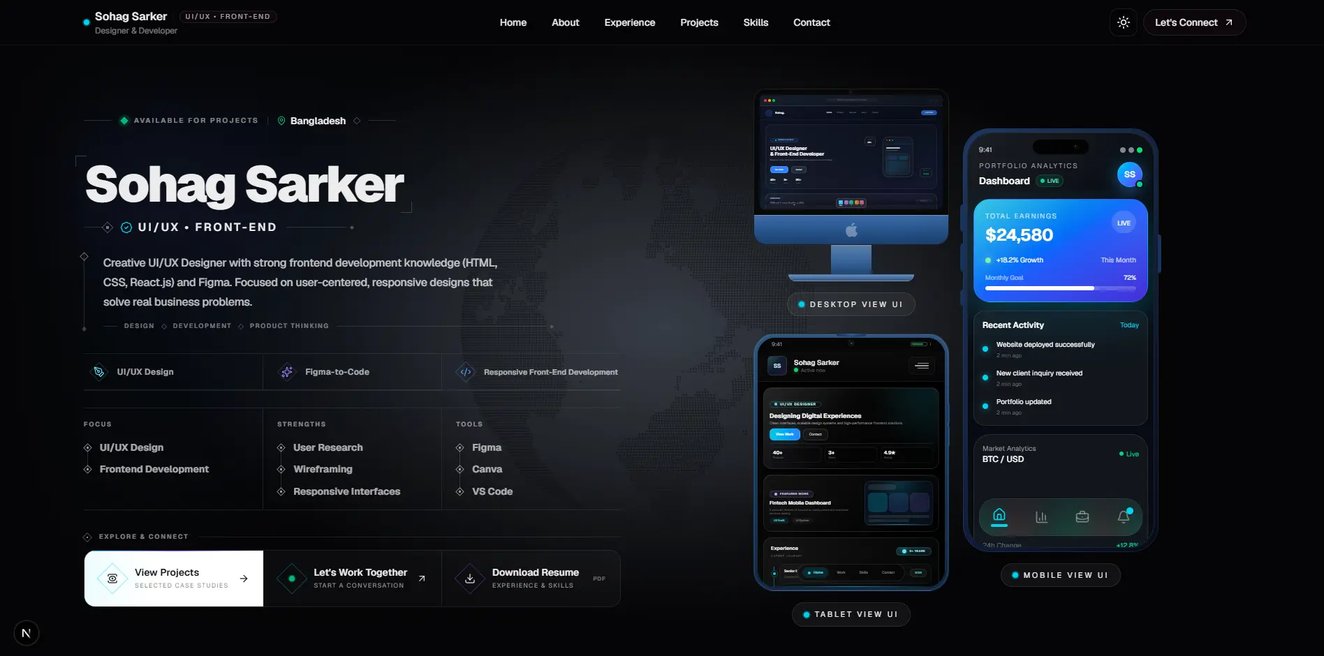
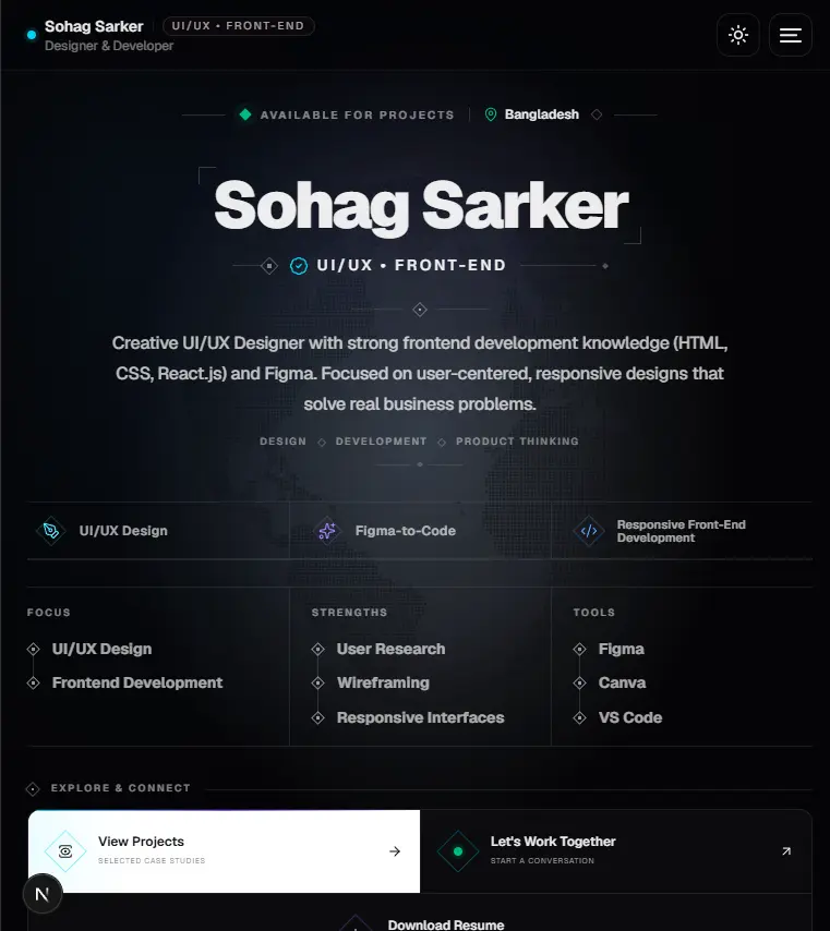
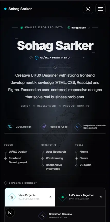
UI/UX Designer & Frontend Developer
Personal Portfolio
Design + Development
2026
The objective was to build more than a traditional portfolio page. The interface itself needed to communicate design quality, responsive frontend capability, interaction thinking, and attention to detail.
The experience was structured around clear hierarchy, responsive project previews, compact information rails, selected motion, and direct paths toward projects, resume access, and contact.
The portfolio needed to communicate design capability, frontend development skills, experience, achievements, services, and selected projects while keeping the interface focused and easy to explore.
Projects, experience, skills, achievements, services, and contact information needed to coexist without making the page feel crowded.
The same visual identity and content hierarchy needed to remain strong across mobile, tablet, laptop, and large desktop displays.
Visitors needed a faster way to browse different project types without scrolling through repetitive full-size project cards.
The process started with organizing the portfolio content and defining a visual language, then moved into responsive behavior and reusable frontend implementation.
Organized the portfolio around identity, selected work, experience, technical capability, achievements, services, and contact.
Defined typography, cyan and violet signals, thin rails, device presentations, dark mode, spacing rules, and reusable visual patterns.
Created layouts and project presentations that adapt across mobile, tablet, laptop, and large desktop screens.
Built reusable Next.js and TypeScript components with responsive behavior and performance-aware image handling.
The final interface gives selected projects strong visual priority while keeping supporting information compact and easy to scan. Clear typography, structured spacing, responsive device presentations, and focused interactions help maintain hierarchy throughout the page.
Desktop, tablet, and mobile views were designed as parts of the same responsive system rather than separate experiences, allowing the portfolio to communicate both product design thinking and frontend implementation capability.
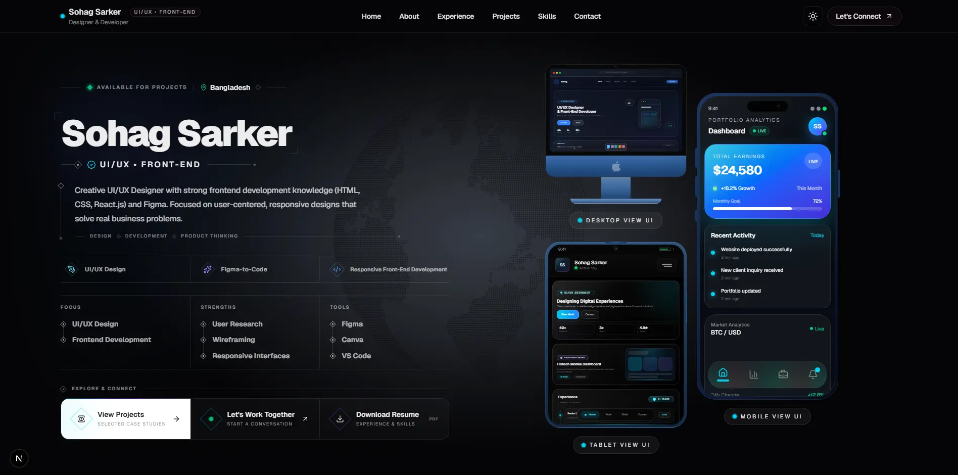
Selected work receives strong visual priority while experience, skills, achievements, and supporting information remain easy to scan.
Desktop, tablet, and mobile presentations communicate responsive frontend capability directly instead of relying only on written claims.
Cyan signals, violet accents, dark mode, compact uppercase labels, rails, and subtle gradients create a recognizable visual identity.
The layout avoids unnecessary decorative elements and keeps whitespace, typography, project imagery, and actions as the main focus.
The final responsive system preserves the same content hierarchy, visual identity, project storytelling, and interaction language across different screen sizes.
The final experience combines responsive frontend presentation, interactive project exploration, clear information hierarchy, personal branding, and direct contact paths inside one reusable design system.